


Watching Type, No. 5: Qualifying the Speedmaster Pilot
Does Omega's new release make sense as a pilot's watch?

Welcome back to the final Watching Type of 2024. This week I’m taking a look at a watch that was announced recently, after what seems like a carefully co-ordinated leaking of the very similar “Flight Qualified” version on Omega Forums and elsewhere.
The Omega Speedmaster Pilot is an interesting new variant of straight-lug Speedmaster with an automatic movement that pitches itself as “Flight Qualified” and leans into a pilot-themed aesthetic. With plentiful pops of colour and unusual details, it seems to have been well received, so I thought I’d break it down from a design perspective.

Ready for takeoff
The Speedmaster Pilot (reference 332.10.41.51.01.002) comes as something of a departure for the Speedmaster line. It’s probably this unexpectedness and novelty that partly accounts for the positive reaction – launches like the white dial Moonwatch inevitably receive as much criticism (from people who find yet-another-Moonwatch boring) as praise (from collectors who’ve been asking for a new white dial variant for years).
One reason why the Pilot is unusual is that it’s not just a new dial in an existing model. It takes as its basis the two-register layout familiar from the Speedmaster ’57, but it uses a different (automatic) movement and a different case. The previous generation ’57 was automatic, but again, it’s a different movement and a different, smaller, case to that model. The calibre 9900 used in the Pilot has only previously appeared in the Speedmaster Racing line and Seamaster 300M and Planet Ocean chronographs, never a flat-lug Speedmaster case style.
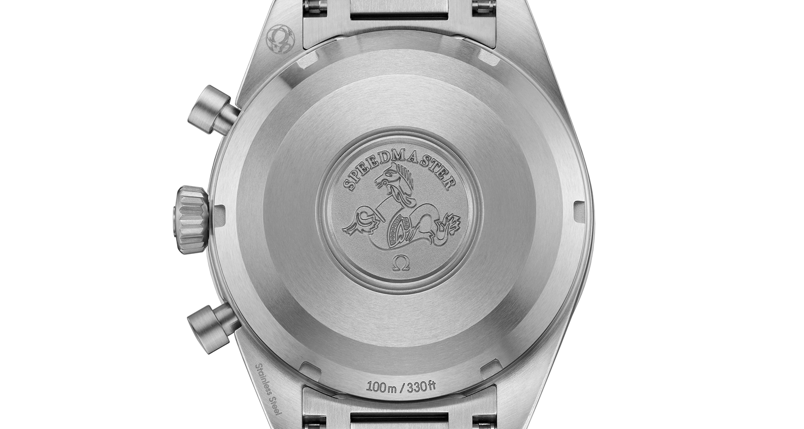
Another unusual feature is that the case and bracelet is fully brushed, a nod to use in the cockpit where reflections from polished surfaces would be undesirable. This isn’t something I can remember seeing on any modern flat-lug Speedmaster1 (though I am not an Omega expert in any way, so feel free to correct me in the comments). In addition, the crown is tapered, like the crown on a Seamaster Aqua Terra. Again, I think this might be a first for a Speedmaster.
And that’s all before we get to what’s happening on the dial: an orange minute and grey hour counter, orange-tipped and “winged” chronograph seconds hand, and a yellow running seconds hand inside a black and blue crosshair subdial, made to look like an artificial horizon readout straight from the cockpit.
Invoking the Flightmaster
So where has this design come from, exactly?
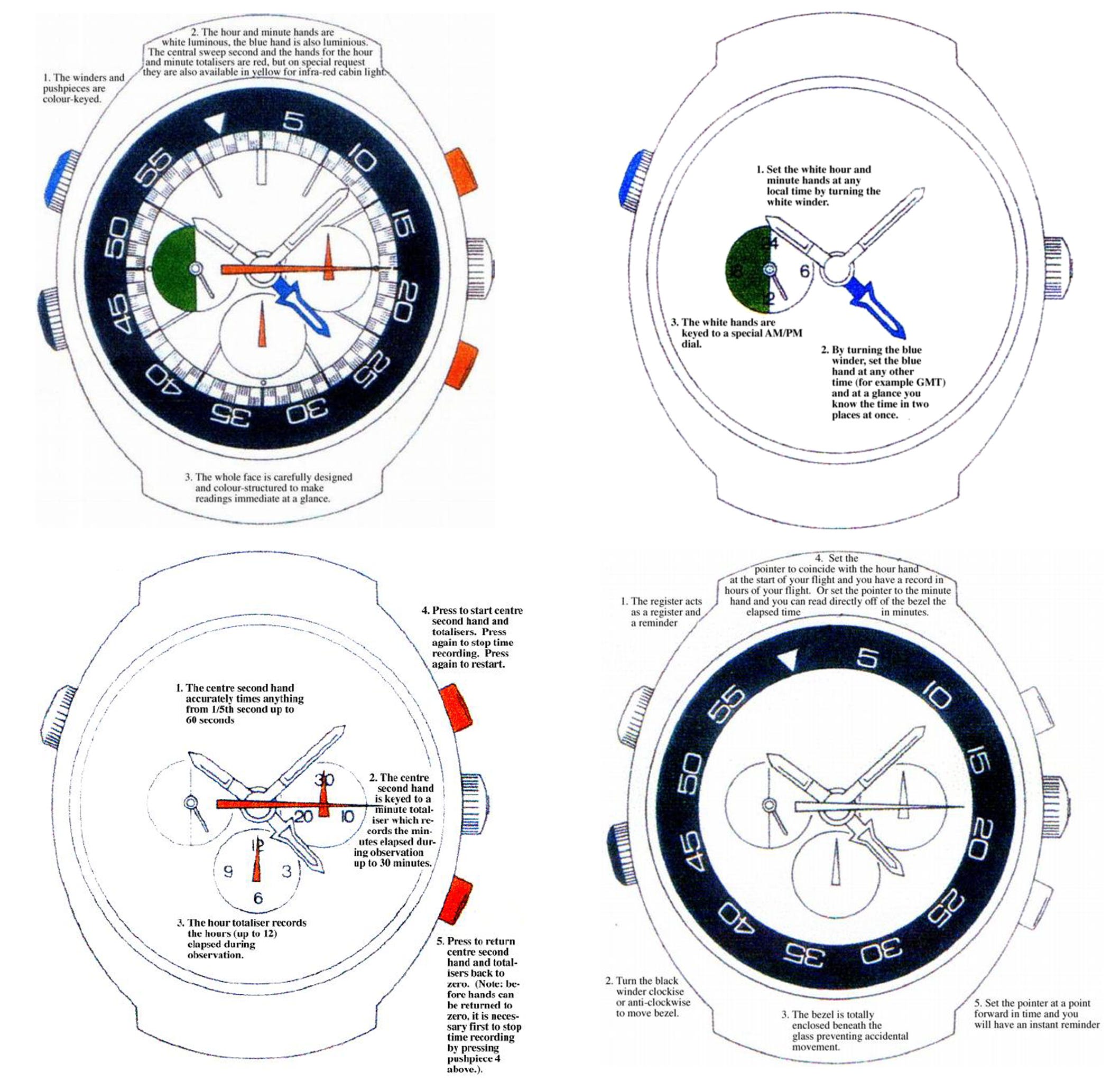
The obvious place to look is Omega’s historic Flightmaster line. The Flightmaster name has not been used since the 1970s, having consisted of a handful of references designed specifically to be aviation tools, but their closest modern equivalent is the X-33 line (indeed, some X-33 prototypes were originally labelled Flightmaster). Flightmasters used bright colour coding to differentiate functions on the dial, such as local time, a second time zone, the chronograph seconds, minutes and hours, an internal rotating count-up bezel, and a 24-hour AM/PM indicator.
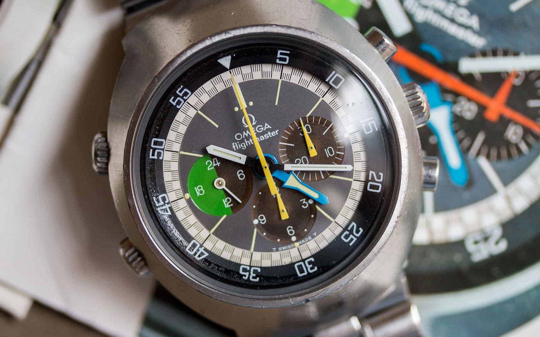
These colour codings are accompanied by coloured paint on the pushers and crowns that match each function on the dial. Yes, the Flightmaster was a serious tool watch.
We can already recognise some of the features of the Pilot dial here. The triangle-shaped chronograph hands are the most obvious, but the segmented bi-colour AM/PM subdial is something that carries through a few different references on the way to the Pilot, which we’ll look at in a moment.

Similarly, the second time zone or GMT hand has a winged “rocket” shape that relates to the winged hands we see on other Speedmaster models – the purpose being that when hands are aligned (in this case with the local hour hand) the wings are still visible, so you can easily spot it.
The “aeroplane” tipped hands begin to appear on watches like the Speedmaster Mark III.

On the Mark III, the orange-tipped hand displays chronograph minutes. Here it is in the reset position, with the “wings” visible from underneath the chronograph seconds hand:

Here too, we see another bi-colour subdial at 9 o’clock, this time showing day/night (tied to the local time) rather than AM/PM, plus running seconds. The horizontal blue and gray split foreshadows the 2024 Speedmaster Pilot. It’s quite possible that this was a direct point of inspiration for the new design, though there are other through-lines…
The Hodinkee influence
In 2018, to celebrate the tenth anniversary of Hodinkee, Omega produced the Hodinkee 10th Anniversary Limited Edition Speedmaster (a.k.a. the “H10”) in a run of 500 pieces. This watch was based on the CK2998 model – which shared a case and movement with the First Omega In Space of the time – but with a custom dial and hands that made reference to Hodinkee founder Ben Clymer’s Speedmaster MK40 that was passed on to him by his grandfather.

The MK40 was a mid-1990s Valjoux automatic-based Speedmaster with a triple calendar complication. It has a blue-and-black AM/PM subdial at 9 and a pointer date, indicated by the yellow-tipped winged hand.
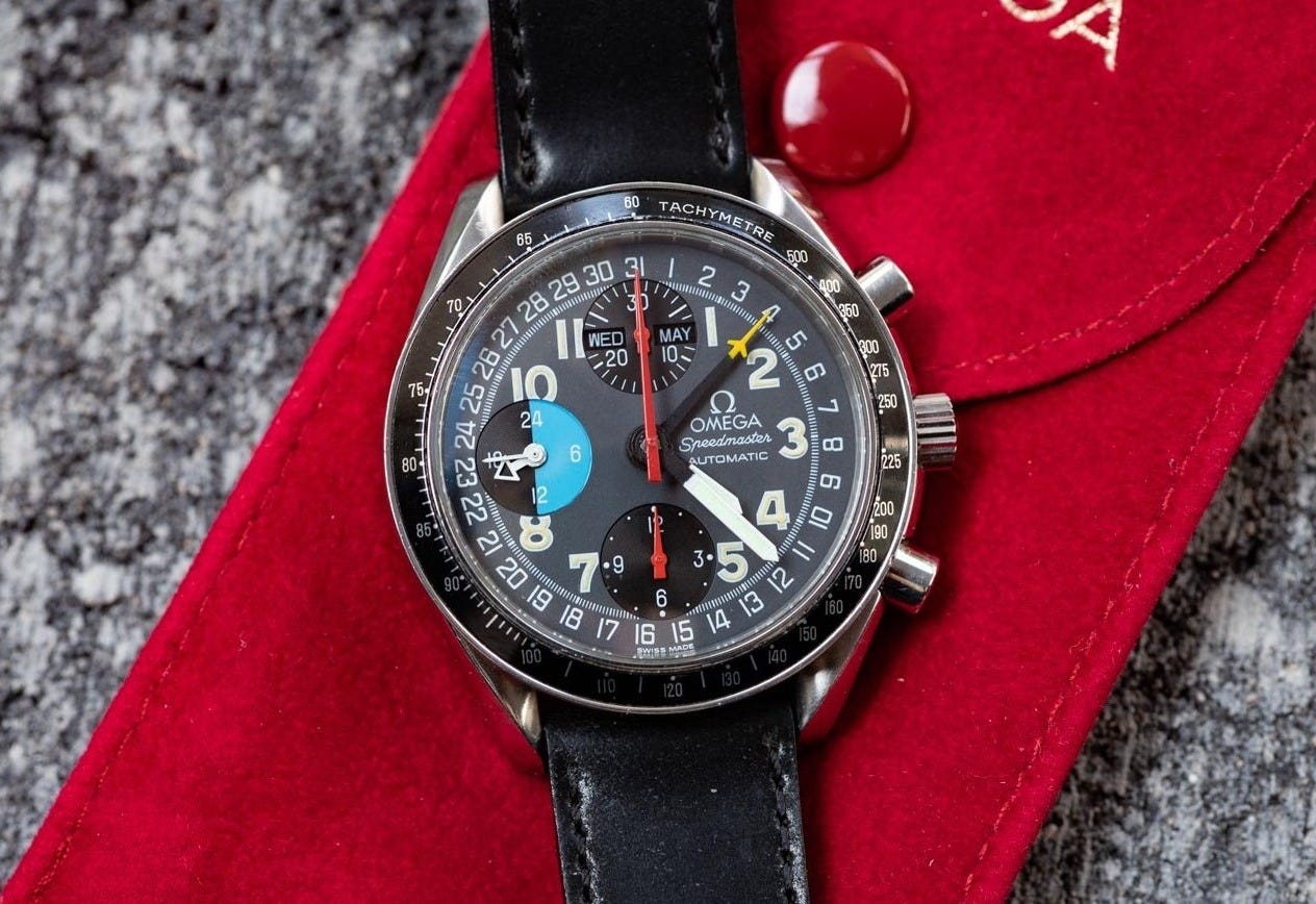
What the H10 design does is carry over these distinctive visual characteristics even though the functionality is no longer there. The running seconds adopts the blue and black AM/PM segmentation2, and the yellow aeroplane tip from the date hand that no longer exists is grafted on to the chronograph seconds hand. It’s pure postmodernism.
Basically, without the H10, I don’t think the Pilot exists. Not only for being a colourful aviation-tool-themed Speedmaster in a flat-lug no-crown-guard case (for which there was no other precedent), but because of its postmodernistic approach of style over substance. I want to be clear here: I’m not saying there is a lack of substance to these watches, per se, nor that the styling is a bad thing. It might be better stated as emotion over function.
What I’m referring to is the design practice of applying the visual signifiers of certain functions in order to create desired associations, even when the functions are not there. In the case of the H10 design, the associations are those of a deeply personal connection with one particular watch. In the case of the Speedmaster Pilot, the associations are if I were a pilot, I would wear this watch. A marketing trope as old as watch marketing itself. Of course, Omega know exactly what they’re doing – it’s precisely why they first produced a version that only flight-qualified pilots in the US were allowed to buy, teased it via Omega Forums and the watch media, and then followed up with the publicly available one. It’s an attempt to validate the watch as a genuine pilot’s tool watch. Did they need to do that? You tell me.

The nitty-gritty
It certainly says “FLIGHT QUALIFIED” on the dial, but then all Speedmasters are flight qualified, aren’t they? You sort of expect that. Maybe that’s just Moonwatches.
The wide style of that text isn’t something I’ve seen from Omega before, and it does jar a little with the other styles on the dial. It also feels jammed in below the Speedmaster logo.
The Futura-based “Co-Axial Master Chronometer” text is present as usual, with “Co-Axial” spaced out much wider than the second line (not a fan of that) and the hyphen in its default position (too low) as always.
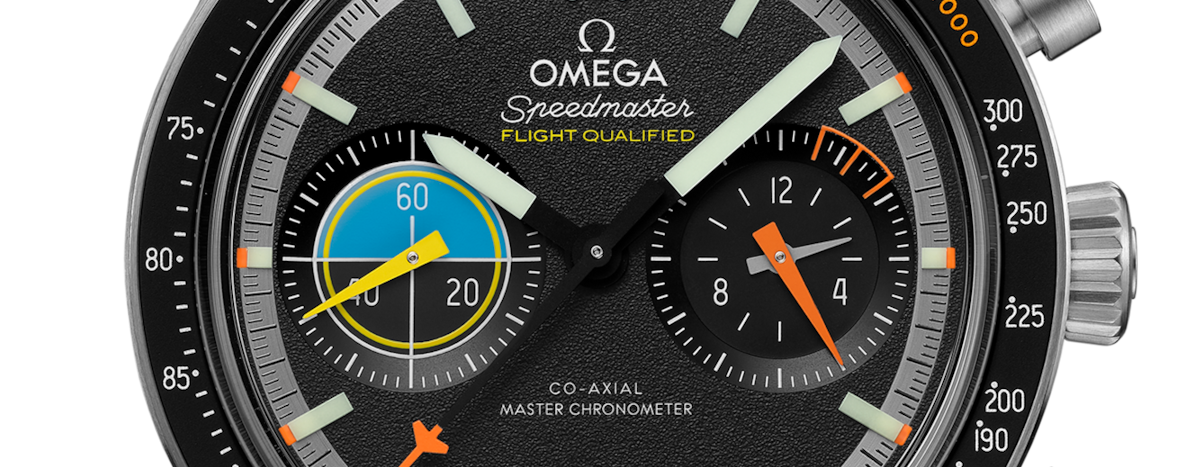
The numerals on the subdials and bezel insert are the new style that Omega debuted on the hand-wound Speedmaster ’57. On the whole, I quite like them. I like the openness of the 2 and the 4, the flat top of the 3 and the sweeping shape of the 7. The 2 in particular is a big improvement over the standard heritage/Moonwatch numerals, being more balanced and less offset to the left. However, it has a few numerals that are slightly less successful in my eye. The 6 and 9 have quite a small loop – I’d have preferred larger, more like the Moonwatch numerals. And finally, the 8 feels a little small due to the upper bowl being narrower than the lower part. Overall: a good effort. These are small details, but small details are appreciated in these quarters.
The date window, unfortunately, does not use these numerals but sticks to Omega’s standard squashed Futura (a shame).
Lastly, let’s talk about the subdials. Here’s what Omega says about them:
At 9H, the Small Seconds display, with its “target/sight” aesthetic inspired by cockpits, features a varnished matte-yellow hand and artificial horizon in blue.
At 3H, the 60-minute and 12-hour recorder is inspired by the “burn-rate” indication in aircraft cockpits, with a triangular matte-orange hand and transferred white numerals.
This leaves us in little doubt that the design process was primarily aiming to evoke the feel of an aviation-themed watch rather than create one to be used by aviators. It reminds me quite a lot of a brand who are the incumbent masters of this: Bell & Ross.
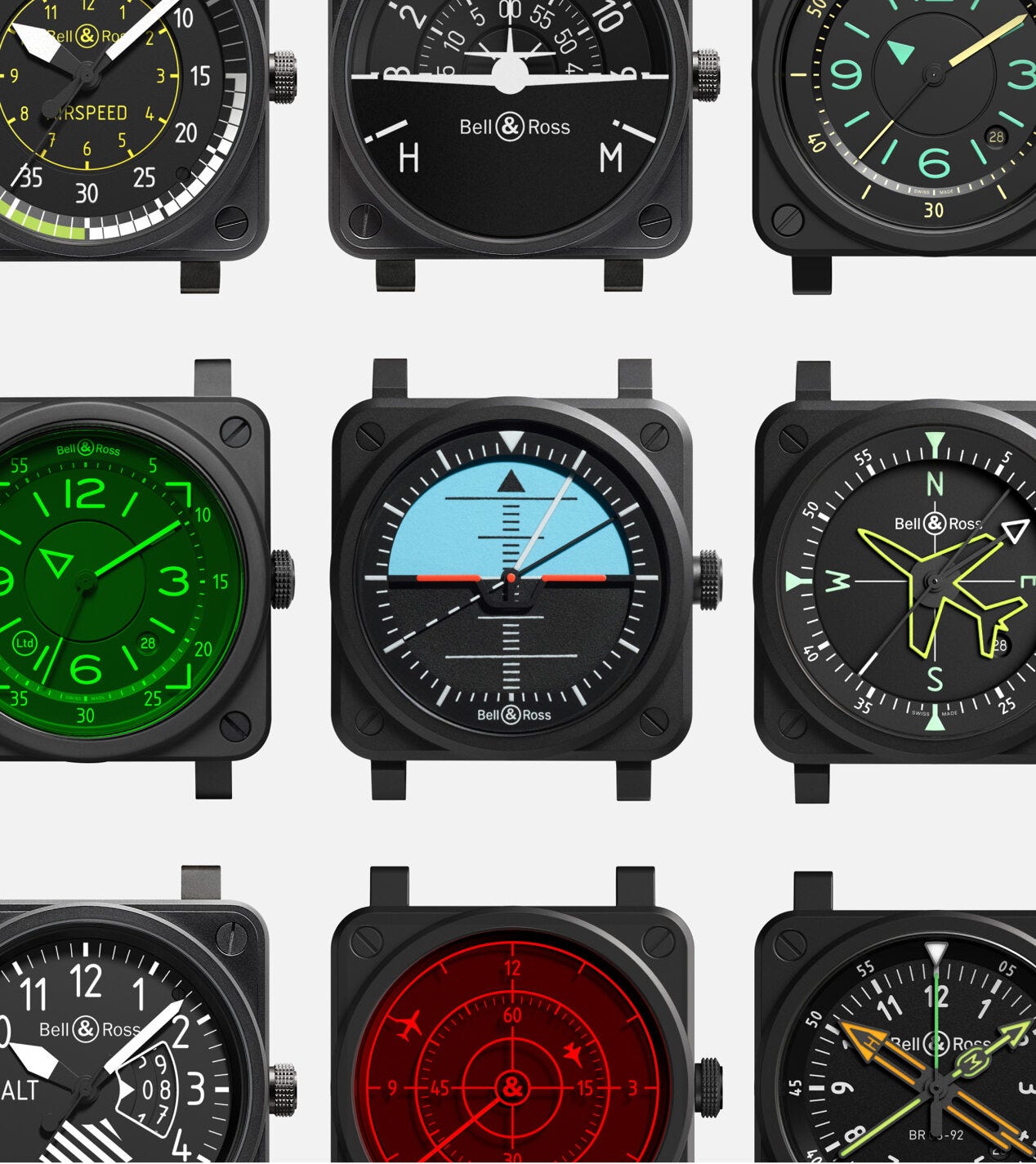
Bell & Ross have a whole line of watches that very explicitly reference aviation instruments, from the case itself to the dial designs, which cleverly adapt a variety of cockpit readouts into time-telling form. The BR-03 Horizon, for example, uses a full-dial disc with an “artificial horizon” graphic as the hour hand.
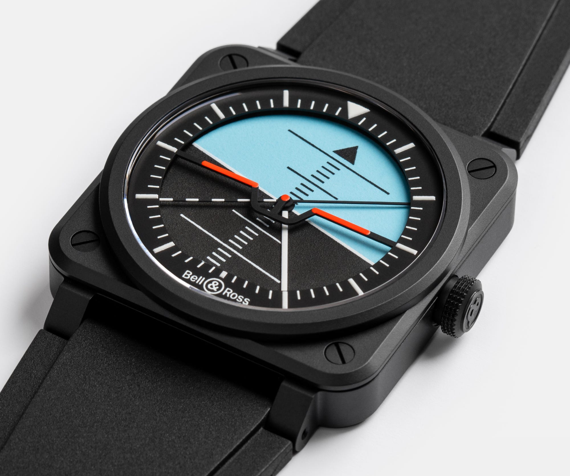
They really commit to their theme, and the graphic design is always slick and tidy with great colours. If you like the concept, I think they’re a ton of fun.
The Speedmaster Pilot attempts to capture some of this colour and fun, but in a much smaller dose. And on its own terms, I think it works, as long as you don’t interrogate it too hard. I’m a little confused by the combination of a target crosshair with the artificial horizon, and I’m not sure what a “burn rate” indicator is supposed to look like since a brief image search doesn’t turn much up. (Again, perhaps someone will enlighten me in the comments.)
The totaliser subdial does have another quirk of its own though – a set of orange hash marks at 3, 6 and 9 minutes. This is a historical feature found on chronographs (particularly pilots’ chronographs) that crops up again and again on vintage watches. The exact reason for it is still not entirely clear – Revolution take a stab here at summarising the main theories – but its inclusion on the Speedmaster Pilot is seemingly to link it to pilots’ watches of the past. Once again: zero practical use, simply an attempt to invoke something it is not.
Ultimately, to me the Pilot feels somewhat caught between trying to be a genuinely useful pilots’ watch and telling a marketing story.

In conclusion
I don’t want it to sound as though I’m bashing the Speedmaster Pilot. I think it’s going to be very successful in its niche. The design is fun, there are some great details (I haven’t even mentioned the brushed minute track or the solid lume blocks on the hands and markers) and it’s undoubtedly a breath of fresh air in the Speedmaster range. Following on from the new First Omega In Space and the updated hand-wound ’57, it’s been a strong recent run for flat-lugged Speedies.
Perhaps, post-Moonswatch, Omega are allowing themselves a little more room to experiment with new designs that appeal to a younger demographic. Here’s to more experimentation and more… well, fun.
That’s all for this issue. Thanks for reading, and I’ll see you for more nerdy watch design analysis in 2025.
Samuel
The Fratello “Alaska III” Speedy Tuesday limited edition used an all-brushed finish on its twisted-lug Moonwatch case and pushers.
In the announcement article, Ben Clymer refers to the blue and black running seconds “taking inspiration from a particular example of an Omega, with a 30-second interval hand, a first for any Omega”. I assume the hand he’s talking about is the propeller-type hand that’s half black and half blue, as you see on some divers watches, but I’m not sure which particular example of an Omega he is referring to. The hand seems to have been chosen to justify the blue and black subdial by lending it a function.