


Watching Type, No. 2: An ode to the Heuer Cortina
A closer look at an Instagram darling

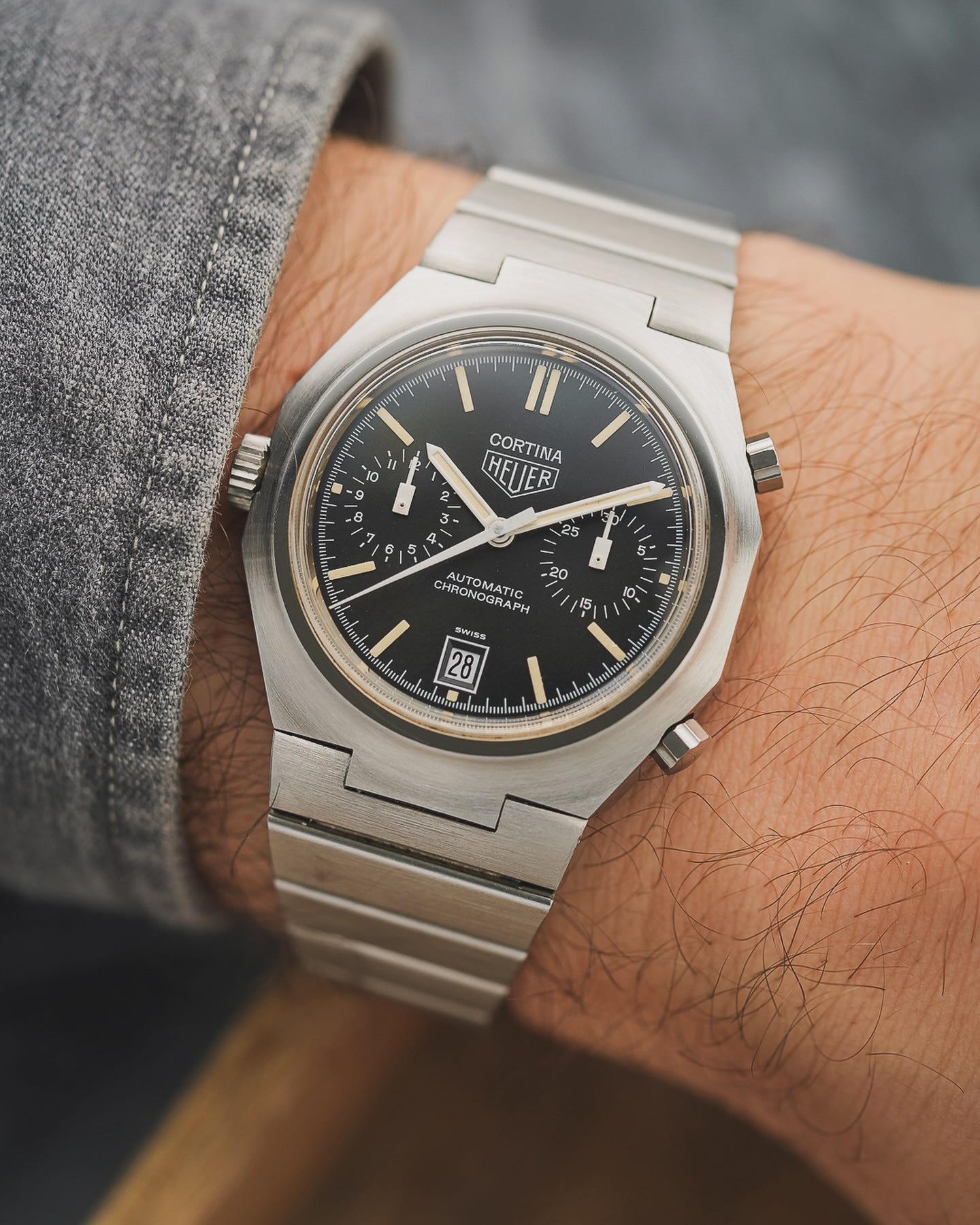
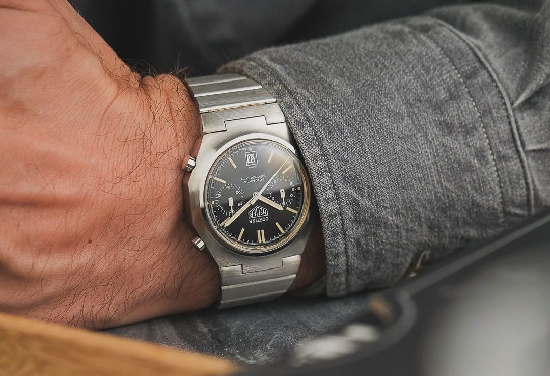
Hello and welcome to this week’s Watching Type. This time I’m taking a look at a watch that recently caught my eye on Instagram: an immaculate example of a 1977 Heuer Cortina, beautifully photographed and offered for sale by Watchurbia. Many thanks to Sebastian for kindly agreeing to let me use his images to illustrate this piece.
Before we get into it, self-promotion protocol dictates that I should mention that an interview with me by Thomas van Straaten was published on the Fratello site a few days ago – check it out here.
Ok, let’s get started.
A different flavour of Heuer chronograph
I have to admit, I was only vaguely aware of the Cortina before I saw this post, and I’ve yet to see one up close. Until recently, of the ’60s and ’70s Heuer chronograph designs, I would have said the Camaro was probably my favourite (ok, the 1960s manual wind Carreras aren’t bad either). Now, having pored over these images, I think that might have changed.
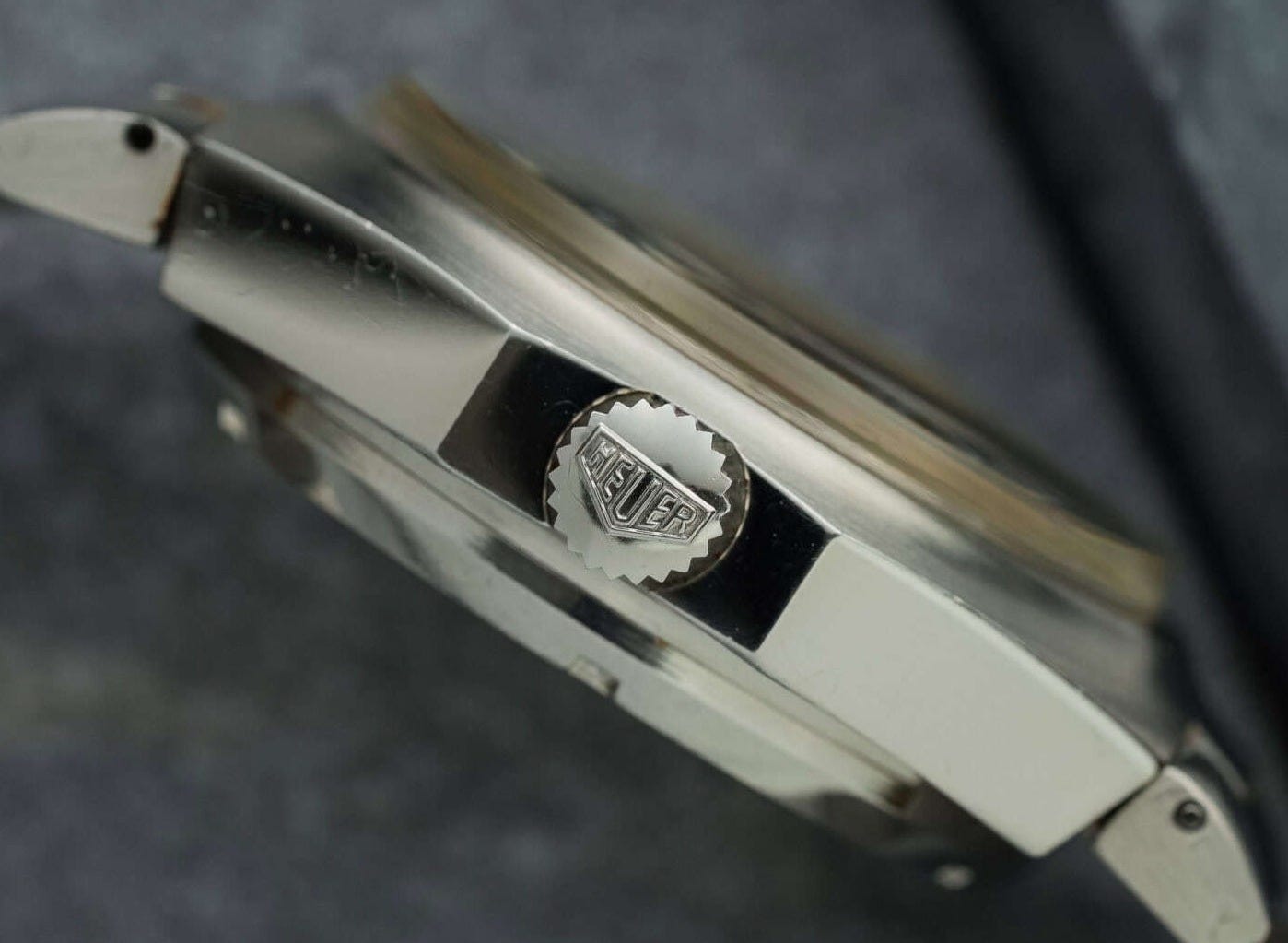
Introduced in 1977, the Cortina was apparently aimed at winter sports enthusiasts rather than following Heuer’s traditional motorsports focus1. Unlike most of Heuer’s ’70s chronographs, there’s no tachymeter scale (the similar but more rounded-shaped Heuer Daytona, which used the same calibre and was introduced the same year, does have one). Inside is the automatic micro-rotor Calibre 12 movement developed with Buren, with a date at 6 o’clock, a thirty-minute counter at 3 and twelve-hour counter at 9. The Heuer-signed crown is also on the left, and there is no running seconds indication.
The standout feature of the Cortina design is immediately obvious: the unusual angular-yet-rounded octagonal case shape with its integrated steel bracelet. Despite the prevailing sense that the ’70s was the decade of integrated bracelet steel sports watches, this wasn’t something Heuer dabbled in very much. The famous Royal Oak and Nautilus bracelets were very expensive and finely finished, and Heuer, essentially, made tools, not jewellery.
However, while most other ’70s Heuers preferred a domed barrel or C-shaped case, the Cortina tried something quite different. Its bezel-less case curves upwards to a flat plane surrounding the plexiglass crystal, and tapers away elegantly at the edges, emphasised by the circular brushing. Comparing it with the (otherwise quite similar) Daytona shows just how different this case looks from the norm at the time:
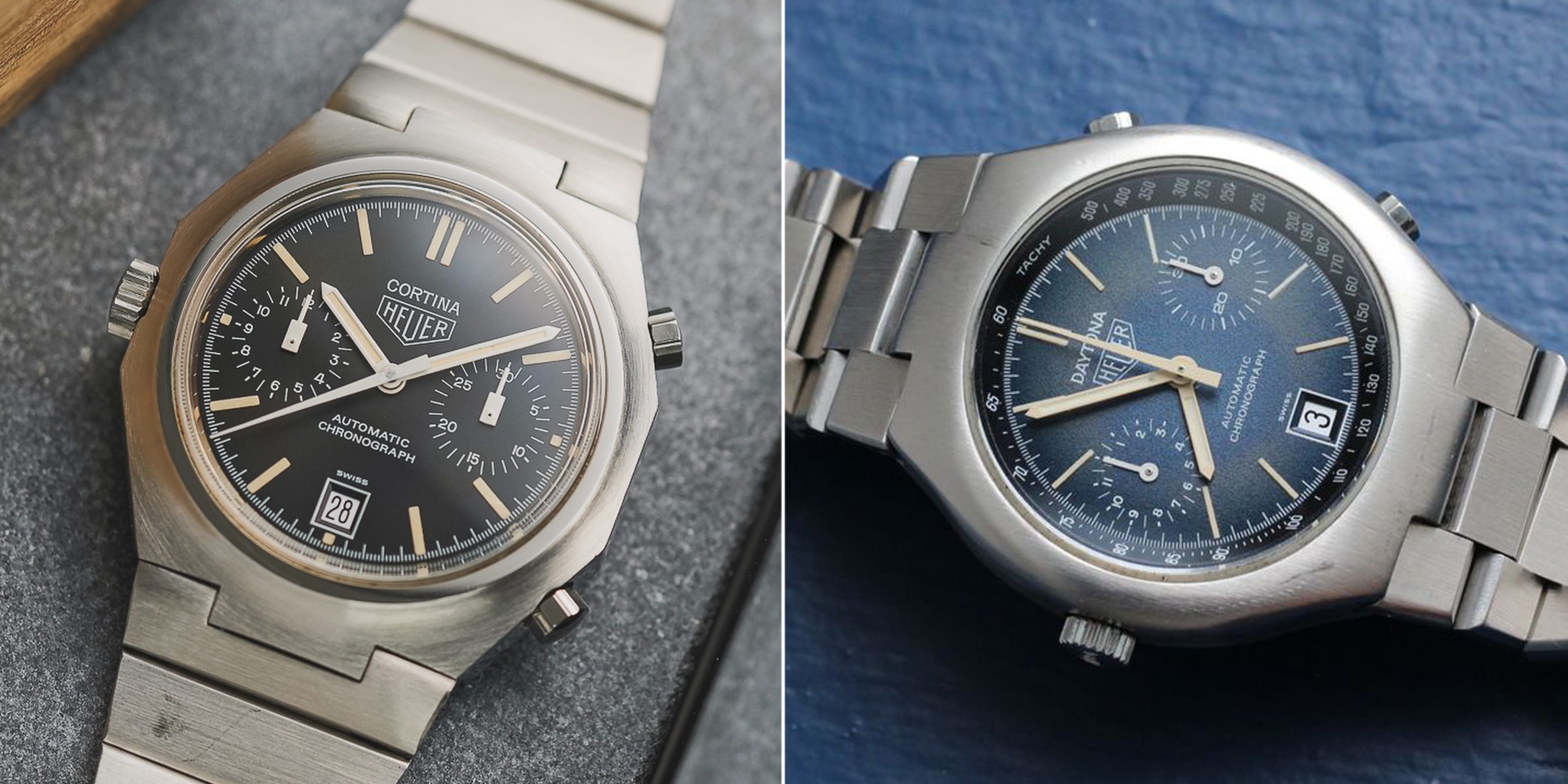
To me, the soft pebble shape of the Daytona makes it look very ’70s, and quite dated. The Cortina manages to look much more bold and distinctive, even timeless.
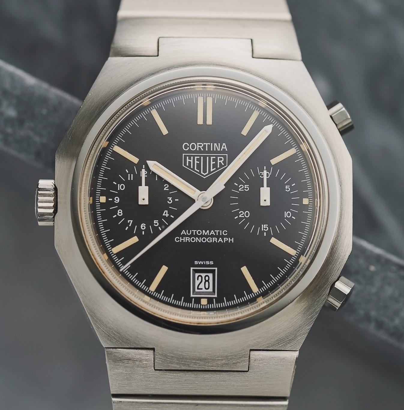
A dial full of detail
The dial of the Cortina is a real masterclass, in my opinion. All the elements work in harmony together, with balance and clarity.
The chronograph register hands have a bold rectangular design that echoes the printed (lume) hour markers, and the two registers use a combination of slightly bolder hash marks where a numeral is placed, and thinner lines in between for the single minute and half hour increments on the respective counters. This, along with insetting the numerals, helps anchor the numbers to the scale but also makes picking out the in-between values easier.
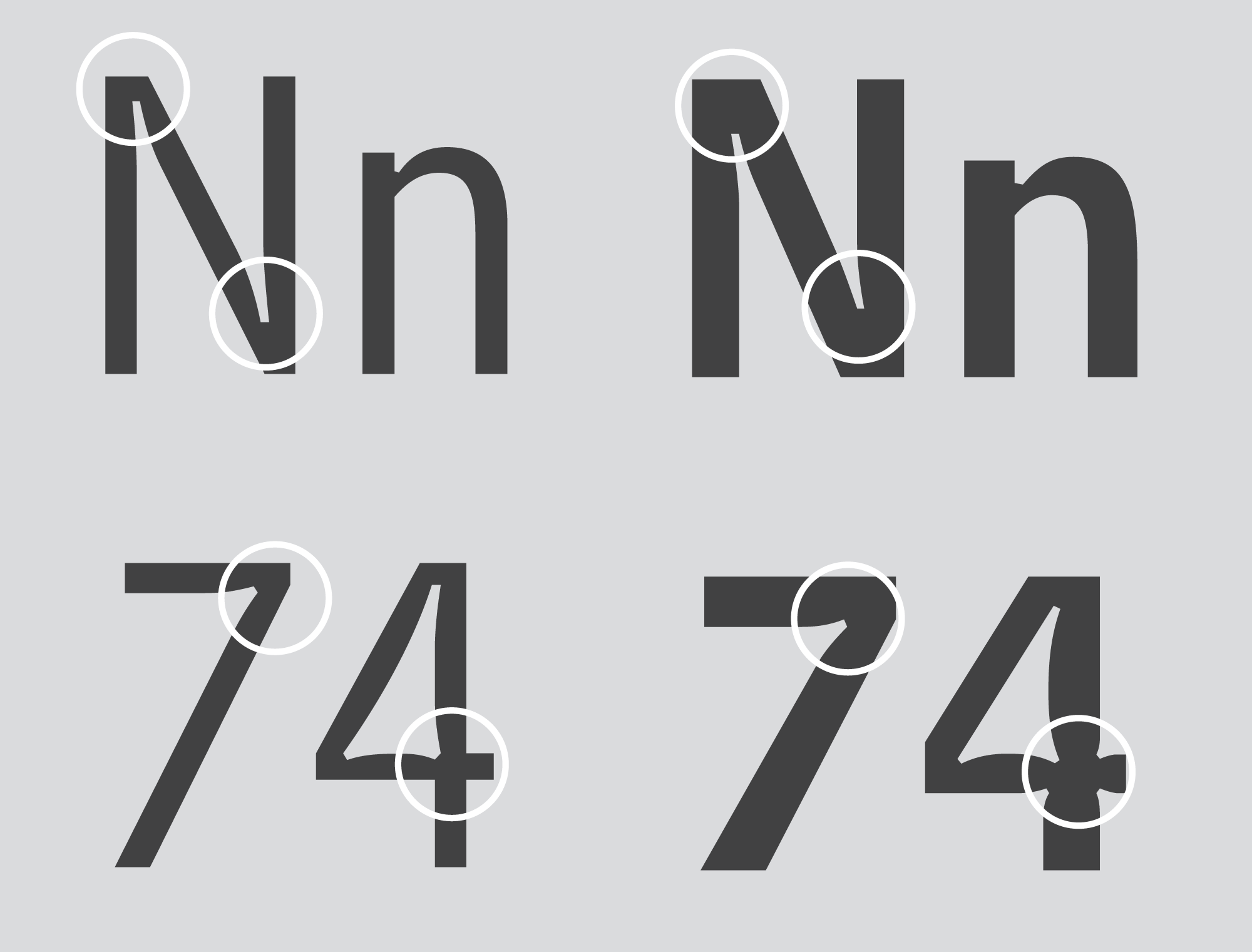
The register numerals themselves are classic hand-drawn dial figures all the way – in this case, with a stick 1 (no overhang), hooked 7, flat-topped 4, and flat-topped 3, all to aid legibility. (I’ll go into the reasons why watch numerals are traditionally designed the way they are in a future instalment of Watching Type.)
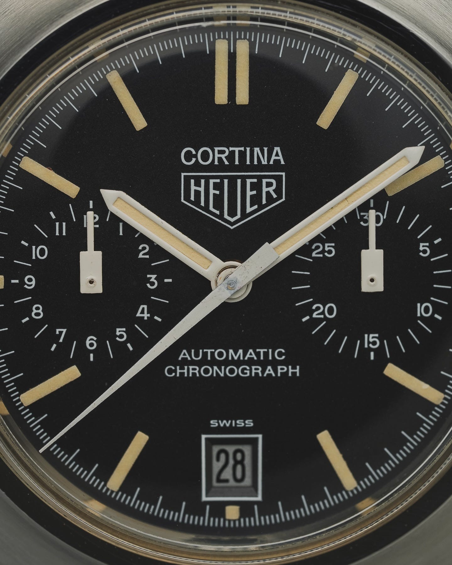
At the top centre is the Heuer logo and model name, in the style that Heuer employed across nearly all their models, with the model name first. The Heuer logo is beautifully rendered with some tiny, barely perceptible serifs to help avoid ink pull-up.
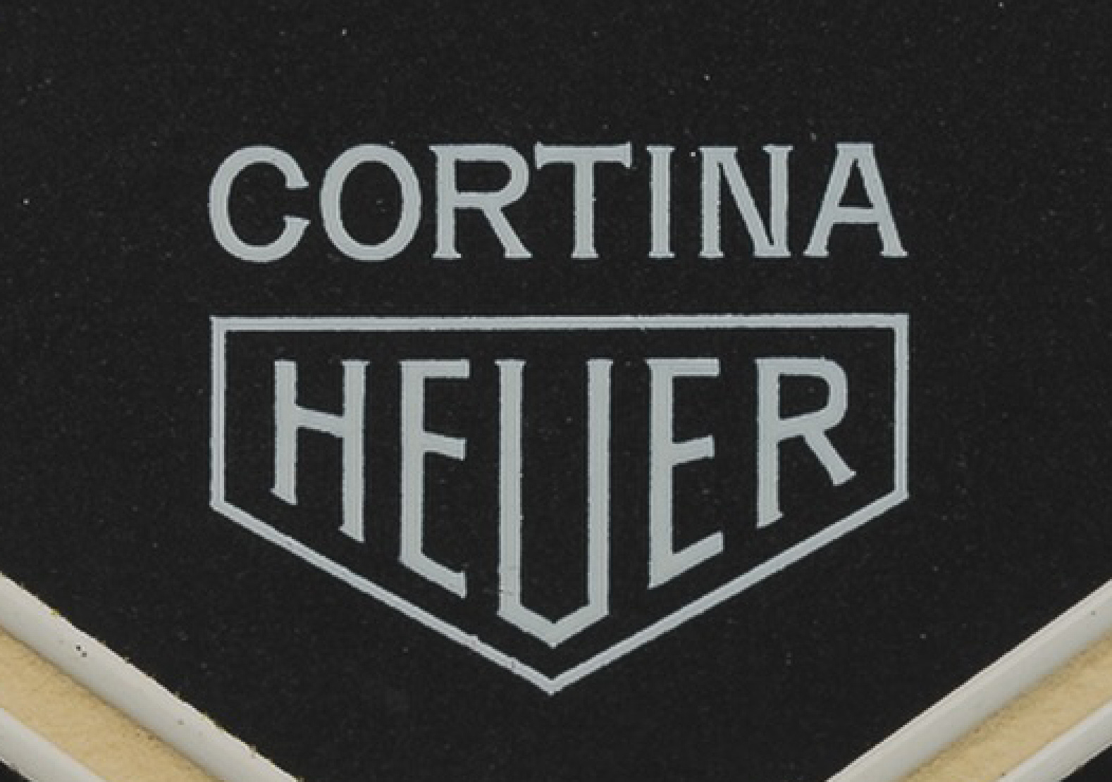
The Cortina text is elegantly drawn and tightly spaced with the same overall weight as the logo, and similar, slightly more pronounced serifs. It elects not to use a flat-topped A, as it’s large enough not to need the extra space inside the letter (and I suspect, in 1977, it might have looked old-fashioned). But there’s one really unusual detail which I love – inside the angles of the N are what are called “ink traps”. This is a feature designed into some fonts that are intended for use at very small scale and/or on a surface that causes the ink to “bleed” (soak into the paper) and the printed letter to spread. Tight inner corners of letters can cause ink to pool up in those areas, so to alleviate this, a space is “hollowed out” of the corner.
An example of this is the Bell Centennial typeface designed by Matthew Carter for AT&T. It included specific styles for printing the telephone directory, which required very small type sizes on lower-quality, uncoated paper: the ideal conditions for heavy ink bleed to result in illegibility.
But, I hear you cry, this is a watch dial, not paper – surely the ink doesn’t bleed into the metal? You’re absolutely correct. And this text is by no means the smallest on the dial. So, why the ink traps? There are two possible reasons. Firstly, it might be that the ink could pool in those corners from the plate transfer and result in a misprint. However, given the overall high quality of the dial printing, I think that’s unlikely. Instead, I think it’s probably intended to mitigate the optical effect. Light type on a dark background, optically, appears larger. Dark type on a light background optically shrinks2. And so to avoid a distracting brighter/bolder spot appearing at those points, some of the white stroke is removed.
My gut feeling is that this is the designer / drafter showing off a little bit, and I love it. Was it strictly necessary? Almost certainly not. Will anyone except nerds like me notice? No. Does it show how much care and pride was put into the job? Absolutely.
Another area where I think the drafter has employed a little flair is the “AUTOMATIC CHRONOGRAPH” text.
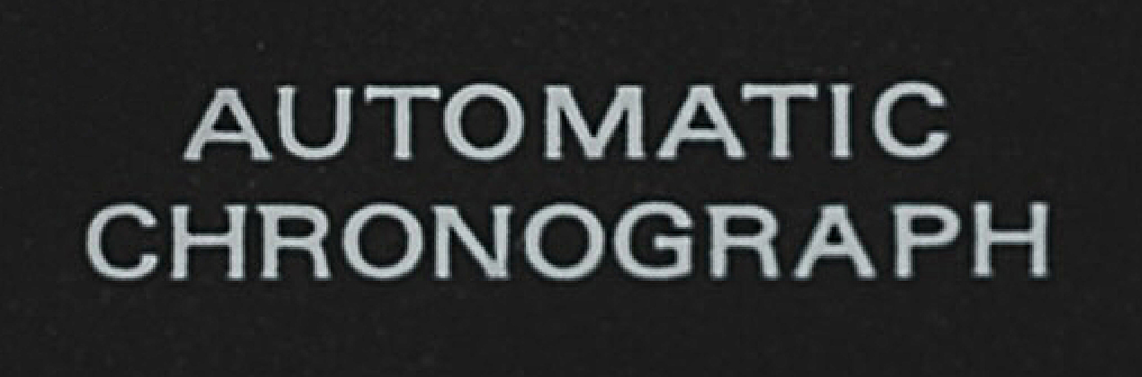
This, unlike any of the other text on the dial, is clearly based on the font Univers, one of the classic modernist “grotesque” sans-serifs. To be clear, watch dial designs of this period were hand-rendered, including the type3, and this is no exception. Fonts were not used except as a reference, and this is why it’s a bit of a flex. These letterforms are not particularly easy to draw by hand – they weren’t designed to be – and it’s a lot harder to make them consistent and look right than traditional dial-makers’ letterforms. The G in particular: chapeau.
It’s maybe also the reason why the kerning looks inconsistent in places on this text (e.g. O/M, R/A/P) – the letterforms are simply less forgiving of being slightly off, and if you’re sticking closely to the design of the font you can’t start making letters wider or narrower as you please (which happens a lot on most pre-digital dials). The extended spacing of R/A/P in CHRONOGRAPH does look a little like the designer realised they needed to make the word a bit wider as they got towards the end… we’ll never know for sure. Fortunately the hand-rendering does mitigate the spacing a bit – if these were digital letterforms it would look worse.
At the bottom of the dial is a neat “SWISS” legend, sized to match the width of the date window and in the standard flat-topped S style. The date window itself is smartly framed in white print and stamped with an internal bevel, the lower bevel edge being shallower than the others – a thoughtful design detail that takes into consideration that the wearer is more likely to read the date from slightly below than from straight-on.
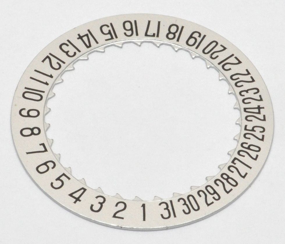
The date indicator contains some lovely hand-drawn numerals, with careful details typical of the period. As you’d expect, stroke thickness is consistent across the different dates. Take a look at the numbers 2, 21 and 22 – the numeral 2 is different in each, maximising the space available without appearing squashed or distorted.
The 1 and 11 include small overhangs, which are omitted wherever else a 1 appears. And the 3s and 8s are quite unusual, with a high centre of gravity that makes them rather distinctive.
I’m sure some will dislike the use of a dark-on-light date wheel. I’ve never been too bothered by this on most watches – dark on light seems to read better at a glance in most situations, I think, and on many watches the light area serves as a replacement for the hour marker that is no longer there, balancing the dial. Suffice to say, it certainly doesn’t bother me here, and I think the watch would look worse with a black date disc.
Overall, what really makes the Cortina design great is how it comes together. Proportionally; in terms of sizing and spacing; the legibility; the shapes of the hands; the letterforms. Everything works in harmony and was clearly designed by someone who really knew what they were doing. I’m a big (new) fan.
By all accounts, the Cortina is quite a chunky watch, at nearly 14mm thick, and I expect it sits high as many automatic chronographs of the ’70s do. So it might be that when I finally get to try one on, the experience may not live up to the design. But I look forward to having the chance to find out.
That’s all for this week. Thanks for reading, and I’ll see you next time.
Samuel
There is even a white dial variant with roman numerals, which probably tells you something about the market they were hoping to capture.
Many signage typefaces, such as the British Rail alphabet, account for this and are designed in different weights for dark-coloured text and light-coloured text. When set in large sizes and viewed from a distance, they appear they same weight.
Hand-rendered type is, strictly speaking, lettering, not typography. The dial is “lettered”, not typeset. No fonts are used.
I love this. Particularly learning about ink traps. You’ve also introduced a different perspective on date windows; my default position is usually that I prefer date discs with their background colour matched to the dial so that the window as a whole is less obvious… but I appreciate legibility is likely to suffer. I hope you’ve got a whole newsletter planned about date windows…the good, the bad and the unforgivable :-)